Okay, so it’s almost 3AM in the morning and you’re about to launch a brand new shiny site.
You’ve tested in on Safari, Mozilla Firefox, Google Chrome, and the scourge of all-browsers: Microsoft Internet Explorer 6, Microsoft Internet Explorer 7 and Microsoft Internet Explorer 8. If you’re wondering why I’ve listed IE 3-times, it’s because each version comes with its own fixes for stuff – yet it breaks other stuff among those fixes. Effectively, you have to test it on EACH version to make sure it stays consistent on Internet Explorer – much unlike it’s counterparts.
You’re snuggling on your bed, and then you decide to give your site a spin on your Apple iPhone – and that works fine, because the WebKit-based engine is very much like Safari’s. And then you take out your old Android phone, but hey, Android’s supposed to be much “better supported” than those i-devices, right?
WRONG.
First look: Transparent-background PNG’s are broken, initial page-viewing panel is messed up and jQuery scripts aren’t loading upon page load.
Problem #1:
Weird Backgrounds with Transparent 24-bit .PNG’s
Hey, doesn’t transparent PNG’s break only in Internet Explorer 6? (yes, that antique, crappy, browser) Apparently not. Seems like it breaks in Android’s Browser too. But a quick Google search reveals that Android has full Transparent PNG support, so how is that possible?
Well, looks like Android’s Browser doesn’t like 24-bit .PNG’s used as overlays – well, 24-bit’s the one with the super sexy colour range, and can do shadows and all kinds of funky effects. In short, it’s not a topic for tonight’s post. 8-bit’s the one that has a limited colour palette – like you know, .GIF files back in the good ol’ days.
Solution #1:
Use 8-bit .PNG’s, with clever “transparency” – especially if you have different coloured backgrounds
Yes, 24-bit is a little cranky in *some* Android phones after a little bit of research. 8-bit works flawlessly though.
Well, in my case, some of the objects I needed to be transparent were spanning multiple background colours, and were overlaying text. How do we solve such a scenario then?
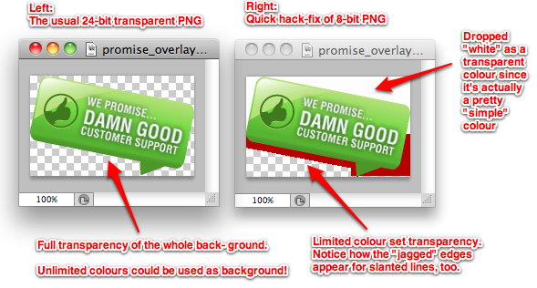
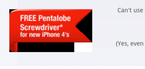
Yep, we “fake” some parts of the transparency by filling the background in – and leave the “real” transparency to only the parts who needed it to be a functional design. Notice that since I only needed the bottom left to be “partially” transparent, I left the rest of the image “background-ed”.
Okay, quick and dirty fix done. Let’s move on.
Problem #2:
Default View when Page Loaded isn’t “Nice”
Ideally, when we design pages, we expect it to look just right the very moment the user steps in to the page. We don’t want to have a user zoom in/out, resize, or change some settings – because the first impression really counts.
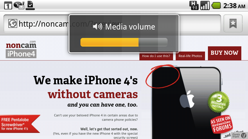
So, what happens when the placeholder-view of the page (is that what it’s called?) looks all messed up, like this?:
In case you haven’t noticed it by now (oh yes, please ignore that ugly overlay for “Media Volume” – my hand accidentally pressed the volume bottom when I was doing the screenshot) – the “ribbon” on the left is partially chopped off, and the whole page is actually SO “closely cropped” towards the frame of the browser, and some text (below) are almost cut away:
Notice the words start at the very first few pixels of the browser frames, and it’s really ugly when viewed inside a real phone – because a user has to take the extra step of resizing it to get to the desired viewing point.
Why this occurs is because Android’s browser automatically finds the “largest” or rather, widest, block object (such as DIV’s, etc) and sizes the maximum viewing area according to that, so things actually might get cut away if positioned using relative or absolute positions.
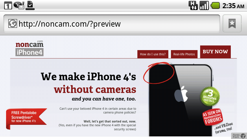
A very quick fix for this is to actually add some padding OUTSIDE of the viewing area, say, maybe 40px per side or so? (I just added padding-left and padding-right to both sides), and well, see the significant difference:
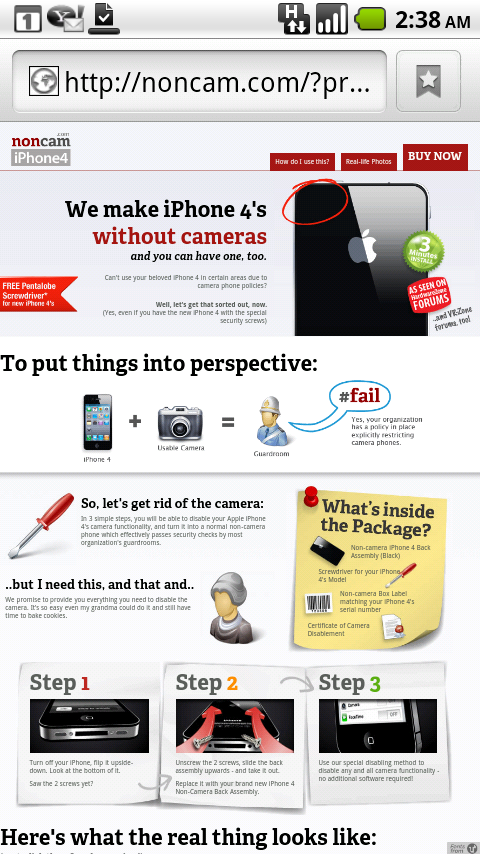
Ta-dah, magically fixed. Now we can see the whole “ribbon” on the left! Okay, now for the more significant part, the rest of the stuff in the body:
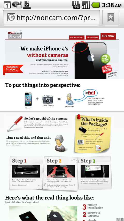
Notice how the whole page looks much more presentable upon first-entry to the site now!
..and we’re done! Two quick fixes for the night. I’ll touch on jQuery another day – because it’s too heavy for an uber early-morning post!

